App design can make or break your product. Research consistently shows that users decide whether to keep or delete an app within the first 30 seconds — and that decision is driven almost entirely by design quality, not features.
In a market where millions of apps compete for attention, the difference between an app users love and one they abandon often comes down to interface clarity, interaction design, and how well the experience anticipates their needs.
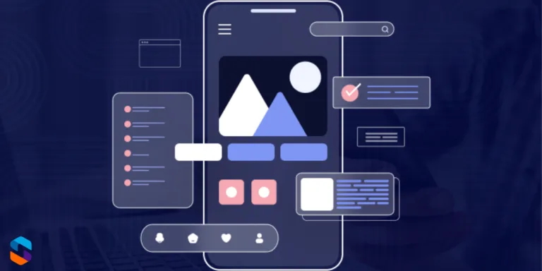
This guide covers 17 mobile app design trends that leading apps are using in 2026, with real-world examples and actionable tips you can apply to your own project — whether you’re building from scratch or redesigning an existing product.
Quick Reference: All 17 Design Trends
| Design Trend | Key Benefit | Example App |
| Simple & Intuitive Interfaces | Reduces abandonment rate | |
| Dark Mode | Reduces eye strain, saves battery | Twitter, YouTube |
| Customisable User Experience | Improves retention | Spotify |
| Gesture-Based Navigation | Faster, more fluid interaction | Snapchat |
| Minimalist Design | Reduces cognitive load | |
| Micro-Interactions | Makes app feel alive & responsive | Facebook, Gmail |
| Voice & Chat Interfaces | Improves accessibility | Google Maps |
| Inclusive Design | Expands audience reach | Microsoft Office |
| Fast Load Times | Reduces drop-off rate | TikTok |
| Real-Time Collaboration | Supports remote teamwork | Google Docs, Slack |
| Security & Privacy First | Builds user trust | Signal, WhatsApp |
| AR & Immersive Experiences | Drives novelty & engagement | Pokémon GO |
| Adaptive & Responsive Design | Seamless across all devices | Netflix, YouTube |
| Integration with Other Services | Improves workflow efficiency | Trello |
| User Feedback & Iteration | Ensures product-market fit | Airbnb, Uber |
| Minimalist Animation | Adds polish without distraction | Slack |
| Environmental & Ethical Design | Appeals to conscious users | Charity Miles |
Part 1: Core UX & Interface Design
1. Simple and Intuitive Interfaces
Simplicity is the single most powerful design principle in mobile apps. Users won’t read instructions — they’ll tap around and if they can’t figure out the app within seconds, they’ll leave. This means every screen should have one clear purpose, navigation should be immediately obvious, and information hierarchy should guide the eye naturally.
Instagram’s enduring success is partly because its core navigation — home, search, reels, shop, profile — hasn’t fundamentally changed in years. Users know exactly where they are and where to go. Radical redesigns, like Snapchat’s controversial 2018 update, show what happens when you break established patterns without good reason.
💡 Apply it: Test your app with someone who has never seen it. Give them a task (e.g., ‘make a purchase’) and watch without helping. Every hesitation is a design problem.
2. Dark Mode: Now a User Expectation
Dark mode has graduated from a feature to a baseline expectation. For OLED and AMOLED screens — now standard on most flagship Android and iOS devices — dark backgrounds consume significantly less power. Beyond battery life, users working at night or in low-light environments report reduced eye strain with dark UIs.
Twitter (now X), YouTube, WhatsApp, Reddit, and most major apps now offer dark mode as standard. iOS and Android both support system-wide dark mode preferences, and apps that don’t respect the user’s system setting feel dated and inconsiderate.
💡 Apply it: Use Android’s DynamicColors API or iOS’s UITraitCollection to implement system-aware dark mode. Avoid hardcoding colours — use semantic colour tokens that adapt automatically.
3. Customisable User Experience
Personalisation has moved from a premium feature to a core expectation. Users want apps that learn from them, adapt to their behaviour, and let them configure their own experience. This ranges from Spotify’s Discover Weekly algorithm to Netflix’s personalised thumbnails to apps that remember your last-used settings.
The business case is clear: personalised experiences increase session length, reduce churn, and improve conversion rates. Apps that treat every user identically increasingly feel generic and impersonal.
💡 Apply it: Start simple — remember the user’s last state (scroll position, last tab visited, preferred settings). Then layer in behavioural personalisation as you collect data.
4. Gesture-Based Navigation
As screens have grown larger, thumbs can no longer comfortably reach top-corner navigation buttons. Gesture-based navigation — swipes, pinches, long-press, pull-to-refresh — moves interaction into the natural thumb zone and feels more fluid than tapping discrete buttons.
Apple’s full-screen gesture system (removing the home button with iPhone X) forced the entire iOS ecosystem to adopt gesture navigation. Android followed. Apps that use gestures thoughtfully — like Snapchat’s swipe-between-camera-and-messages model — feel intuitive and fast. Apps that implement obscure gestures without any discoverability cues frustrate users.
💡 Apply it: Gestures should always have a visible alternative (a button or on-screen cue). Never rely on gestures alone for critical actions — users need to be able to discover features without prior knowledge.
5. Minimalist Design: Less UI, More Clarity
Minimalism in app design isn’t about making things look sparse — it’s about removing everything that doesn’t serve the user’s goal. Every extra element on screen competes for attention. Minimalist design reduces cognitive load, speeds up decision-making, and makes the app feel premium.
Google’s Material Design system is built on this principle. Google Search, Google Maps, and Google Pay all achieve complex functionality with surprisingly clean interfaces. The complexity is hidden behind thoughtful progressive disclosure — showing users only what they need, when they need it.
💡 Apply it: Audit your screens: remove any element that doesn’t directly help the user complete a task on that screen. If you can’t justify why something is there, it shouldn’t be there.
6. Micro-Interactions: Making Apps Feel Alive
Micro-interactions are the small, functional animations that happen when you interact with an app — the heart bouncing when you like a post, the haptic pulse when a toggle switches, the subtle loading animation that keeps you from feeling like the app has frozen. These tiny details collectively create the sense that an app is polished, responsive, and alive.
Done well, micro-interactions provide feedback (confirming an action worked), guide behaviour (showing what’s interactive), and add delight. Gmail’s undo-send snackbar is a perfect example — it confirms the action, provides recovery, and disappears cleanly.
💡 Apply it: Focus micro-interactions on your most-used actions first (submit, like, add to cart). Keep them under 300ms — any longer and they feel like lag rather than delight.
Part 2: Advanced Interaction & Accessibility
7. Voice & Chat Interfaces
Voice interaction has matured significantly. Users are comfortable talking to their devices for navigation (Google Maps), search, and smart home control. Within apps, well-designed voice commands reduce friction for users who find typing on mobile cumbersome — particularly for search, dictation, and hands-free use cases.
Alongside voice, in-app chatbots have evolved from clunky FAQ trees to genuinely useful AI-powered assistants. Apps that integrate intelligent chat support see measurable reductions in support ticket volume and improvements in user satisfaction.
💡 Apply it: Add voice search as a complement to text search — it requires minimal development effort with platform APIs (SpeechRecogniser on Android, SFSpeechRecognizer on iOS) but is highly valued by users.
8. Inclusive Design: Building for Everyone
Inclusive design — ensuring your app is usable by people with visual, motor, cognitive, or hearing impairments — is both ethically important and commercially smart. Globally, over 1 billion people live with some form of disability. Designing inclusively expands your potential user base and demonstrates social responsibility.
Key accessibility features include sufficient colour contrast ratios (WCAG AA minimum: 4.5:1), scalable text that respects system font size settings, voice-over/screen reader compatibility, and touch targets of at least 44×44 points. Microsoft has led the industry here, with accessibility built into its design system from the ground up.
💡 Apply it: Run your app through Android’s Accessibility Scanner or iOS’s Accessibility Inspector before each release. These free tools identify issues automatically and take minutes to run.
9. Fast Load Times: Speed Is a Feature
Page speed research from Google consistently shows that 53% of mobile users abandon an app or site if it takes more than 3 seconds to load. Speed is not a technical metric — it’s a design metric. Slow experiences feel broken, untrustworthy, and frustrating, regardless of how good the UI looks.
TikTok has famously optimised its content delivery so that videos begin playing almost instantly, keeping users in a continuous scroll loop. Every second of latency you remove translates directly to improved retention.
💡 Apply it: Use skeleton screens instead of loading spinners — they show users the layout is loading rather than frozen, reducing perceived wait time by up to 20%.
10. Real-Time Collaboration
Post-pandemic work patterns have made real-time collaboration a core feature expectation in productivity, communication, and creative apps. Users expect to see live changes, presence indicators (who else is viewing), and instant sync — not ‘refresh to see updates.’
Google Docs’ real-time multi-cursor editing redefined document collaboration. Figma did the same for design. Slack and Notion for team communication and knowledge management. If your app involves any kind of shared content or teamwork, real-time sync is no longer optional.
💡 Apply it: WebSockets or Firebase Realtime Database can implement live sync with relatively low complexity. Start with presence indicators (showing who’s online) before tackling full real-time editing.
Part 3: Trust, Technology & Growth
11. Security & Privacy-First Design
Privacy is now a design concern, not just an engineering one. Users are acutely aware of how their data is used, and apps that communicate clearly about data collection, offer granular permission controls, and default to privacy-safe settings earn significantly more trust, which is why strong app security practices have become essential in modern development.
Signal and WhatsApp built their entire brand identity around end-to-end encryption. Apple’s App Tracking Transparency framework — requiring apps to explicitly ask permission before tracking users — caused a measurable industry shift toward privacy-respecting design. Apps that feel ‘surveillant’ or ask for unnecessary permissions face increasing user backlash and app store scrutiny.
💡 Apply it: Follow the principle of minimal data collection: only request the permissions you actually need. Display a plain-English explanation of why you need each permission before the system prompt appears.
12. AR & Immersive Experiences
Augmented Reality has moved beyond novelty. IKEA Place lets users visualise furniture in their home before buying. Sephora’s virtual try-on shows makeup on your face in real time. Pokémon GO proved that AR could drive mass-market engagement. In 2026, with Apple Vision Pro establishing spatial computing as a category, AR features in mobile apps are becoming a genuine differentiator.
The barrier to entry is lower than ever — ARKit (iOS) and ARCore (Android) provide robust frameworks, and Unity and Unreal Engine support AR development without custom tooling. AI-powered features — intelligent search, personalisation, predictive text — are similarly becoming table stakes.
💡 Apply it: You don’t need full AR to benefit from this trend. Adding a simple ‘view in your space’ feature for a single product category is a low-effort, high-impact starting point.
13. Adaptive & Responsive Design
Your app runs on a 4.7-inch iPhone SE, a 6.9-inch Galaxy S25 Ultra, an iPad, and potentially a foldable device with a flex-hinge display. Adaptive design ensures it looks intentional and functions correctly on all of them — not stretched, not cramped, not broken.
Netflix and YouTube are exemplary here. On a phone: content fills the screen, navigation is at the bottom. On a tablet: a sidebar appears, content tiles expand. On a TV: the entire paradigm shifts to a 10-foot UI. Each experience feels native to the device.
💡 Apply it: Design at multiple breakpoints from the start — it’s exponentially harder to retrofit responsiveness than to design for it upfront. Use auto-layout in Figma/Sketch to prototype adaptive behaviour before writing code.
14. Integration with Other Apps and Services
Users live in ecosystems of apps. They expect their tools to talk to each other — calendar apps syncing with video call platforms, project management tools connecting to messaging, e-commerce apps linking to payment services. Apps that exist in isolation feel incomplete.
Trello’s power-up ecosystem (integrations with Slack, Google Drive, GitHub, Salesforce) is a masterclass in this. Integration isn’t just about convenience — it’s about becoming indispensable in a user’s workflow. For Android app development in particular, seamless integration with the broader Android ecosystem (Google Assistant, notifications, widgets, share sheets) significantly improves perceived quality.
💡 Apply it: Identify the top 3 tools your users already use alongside your app. Build integrations for those first. Even a simple ‘export to Google Sheets’ or ‘share via Slack’ feature dramatically improves perceived utility.
15. User Feedback & Continuous Iteration
The best-designed apps in the world — Airbnb, Uber, Instagram — are not products of genius single vision. They are the result of thousands of small experiments, A/B tests, user interviews, and data-informed iterations. Building a feedback loop into your design process is not optional; it’s the process.
In-app feedback mechanisms (rating prompts at the right moment, short surveys after key actions, accessible support channels) provide the raw material for continuous improvement. Airbnb’s obsession with host and guest feedback has driven nearly every major product decision the company has made.
💡 Apply it: Trigger your rating prompt only after a clearly positive user moment — completing a purchase, achieving a goal, finishing a task. Asking for a review when a user is frustrated is the most common rating prompt mistake.
16. Minimalist Animation
Animation in apps serves one of three purposes: providing feedback (confirming an action), guiding attention (directing the user’s eye), or adding delight (making the experience feel premium). The problem is when animation is used purely decoratively, without purpose — then it becomes noise that slows users down and drains battery.
Slack’s micro-animations — the way channels load, messages appear, and status indicators pulse — are invisible when they’re working. You notice them only when they’re absent and the app feels flat. That’s the goal: animation that feels inevitable, not decorative.
💡 Apply it: Follow Google’s Material Motion guidelines or Apple’s Human Interface Guidelines for animation duration and easing curves. 200–300ms with an ease-in-out curve covers 90% of UI transitions correctly.
17. Environmental & Ethical Design
A growing segment of users actively chooses products aligned with their values. Apps that demonstrate genuine commitment to sustainability (energy-efficient code, carbon offset programmes, ethical data practices) and social responsibility resonate with this audience in ways that traditional features don’t.
Charity Miles turns physical activity into charitable donations within the app experience itself, making social good part of the core product. Apps that surface their environmental impact data, support ethical supply chains, or donate a percentage of revenue to causes build communities, not just user bases.
💡 Apply it: Even small signals matter: publishing your app’s privacy policy in plain language, providing a data deletion option, and stating clearly that you don’t sell user data communicates ethical design to users who are looking for it.
Frequently Asked Questions
What is the most important aspect of mobile app design in 2026?
Simplicity and speed. Users have lower tolerance than ever for complex navigation or slow load times. An app that does fewer things exceptionally well will outperform an app that does many things adequately. Focus on your core user journey first — make it flawless before adding features.
How do I make my app more user-friendly?
Start with usability testing with real users — even 5 unmoderated sessions reveal the majority of critical issues. Then prioritise: fix navigation confusion first, then visual hierarchy, then micro-interaction polish. Tools like Maze, Hotjar, and UXCam provide in-app behaviour data that supplements user interviews.
Does dark mode improve app performance?
On OLED/AMOLED displays (standard on most mid-range and premium smartphones), dark mode can reduce screen power consumption by 30–60% depending on how many pure-black pixels are displayed. It doesn’t improve processing speed, but the battery saving is real and measurable.
Should I use AR in my app?
Only if it solves a genuine user problem. AR for the sake of novelty rarely retains users. But if your product involves physical objects (furniture, clothing, home decor, real estate), AR product visualisation has proven to significantly increase purchase confidence and reduce return rates.
How do I keep up with app design trends?
Follow platform release notes from Apple (developer.apple.com) and Google (developer.android.com) — new design system updates often signal where the industry is heading. Design community resources like Mobbin, Dribbble, and Lyssna’s research library are also excellent for staying current.
Conclusion
Great app design in 2026 is the result of combining foundational UX principles — simplicity, speed, accessibility — with modern interaction patterns like gesture navigation, dark mode, and real-time collaboration. The apps that win aren’t necessarily the most feature-rich; they’re the ones that make users feel understood, which is also why thoughtful mobile app development solutions play a key role in turning good design into a seamless real-world experience.
Start with your core user journey. Make it simple. Make it fast. Make it accessible. Then layer in the trends that are genuinely relevant to your users — not because they’re fashionable, but because they solve real problems.